People of ALL ages go online to research before buying, before donating, before traveling, before doing a wide variety of actions. And because print sources of information are becoming more and more limited (e.g., Yellow Pages, newspapers), the importance of having quality information about your charity or association on your website is an absolute requirement.
Did you notice that I said “quality” information? This includes quality design.
 Yet with all the resources available these days, there are still scores of nonprofits with mediocre websites.
They ‘drop the ball’ when it comes to website layout and content. Or they spend all their effort on glitzy images and forget basic communication principles.
For example: Tons of “wow” photos don’t replace quality content and layout – the workhorses that actually get visitors to donate or join.
A recent article by MarketingProfs triggered my post today. They highlighted 6 top reasons (based on an analysis of 1-million websites) that small business websites fail. And I believe the same problems hold true for nonprofit websites. I’ve added a seventh failure to their list of six.
What are the seven ways nonprofit websites ‘drop the ball’ and consequently yield less-than-optimal results?
1) Not built right for mobile devices
Doesn’t matter how small you are, you must design for the mobile audience. If your site is a WordPress design, there are plugins to create basic adjustments for mobile audiences.
If your site doesn’t render well on mobile devices (including tablets and smartphones), then you’ll frustrate visitors and potential donors and members. In other words, very few will stick around to do anything of value on your site.
And don’t forget that the majority of people access their social media networks via mobile. So any links to your site must take them to mobile-friendly landing pages. http://pkscribe.com/nonprofit_news/3-strategic-decisions-your-nonprofit-needs-to-make/
2) Anti-Social Media
In the small business study, 80.5% of SMB (small business) websites had no social media links – Facebook, Twitter, Pinterest, Google+, LinkedIn, foursquare, etc. That’s shocking!
I’d like to think nonprofit websites would post a lower number (meaning more of them do this right), but I doubt it would be close to 100%. And even if the sharing icons are there, web visitors need to find them.
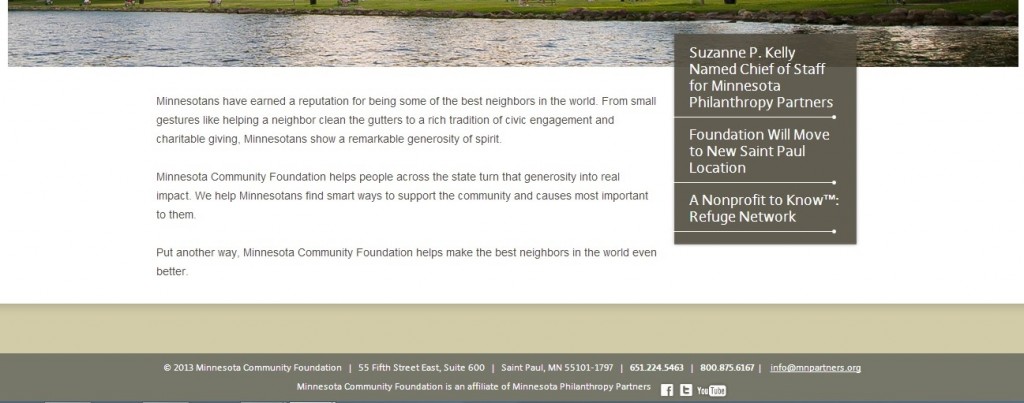
This gets to be a delicate balance between your primary call to action on any given page – which is probably something other than getting visitors to share the content on a social network – and making it easy to find the social media links. But having the links / icons “grayed-out” in the footer doesn’t seem like the right answer to me either (see example below from MNcommunityFoundation):

3) e-Fail
The study cites the failure of nearly 3-quarters of the SMB websites to have an email link on their homepage for consumers to contact the business.
For nonprofits, not only does it need to be there … but it needs to be easy to find. AND, you need to give people a reason for signing up for your email list.
For example: “Join Our Mailing List” just doesn’t cut it.
4) (Lack of) Information, Please
This refers to any type of form-fill option for people to request information. This ought to be a default step when creating and updating nonprofit websites. But again, also give people the ability to reach you by phone.
Here’s another incentive for having a form-fill option where people include their email for sending and receiving your reply: It’s another way to build your email list. Just make certain that you get permission to stay in touch after replying to their initial inquiry.
5) E.T. Can’t Phone Home
You can’t escape the phone. I believe a phone number ought to be prominent on every page. Make it easy for donors and members to reach you in a variety of ways.
And when you train your call staff well, they can really improve the quality of data you have on donors; and they can become a revenue center. That’s right. They can request donations!
6) SEO struggles
If you have a website and no one can find it, does it really exist?
What are the keywords for your type of nonprofit? Is the copy on the pages optimized for SEO? Are you employing other key SEO tactics?
Done well, you can enjoy a nice chunk of organic traffic.
Here’s a seventh failure that I added to the list which is also a peeve of mine,
7) You do WHAT? And WHO are you exactly?
Within 3 seconds of landing on your nonprofit website, visitors ought to understand the gist of what you do and be able to confirm who you are. That means the content – not the images, but the content – above the fold must communicate this quickly and clearly.
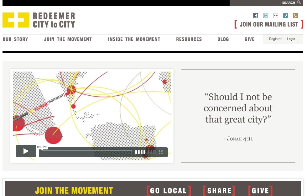
Any idea what this nonprofit does?

I have no idea what they do.
Fix the problem by adding a few words to the header so the message appears on every single page people land on. On your HOME page, include a short paragraph above the fold (no scrolling required) that summarizes how donors make a difference when they support your charity. Or state how professionals will have more success in their career by joining your association.
And avoid acronyms like the plague. Associations seem to be the worst offenders of this. Don’t assume everyone coming to your site knows what the heck your acronym stands for.
The name of an organization seldom reveals what it is you do and therefore who you really are. Only a handful of household names can rely on this. For example: American Red Cross. And even they have problems getting enough people to realize the breadth of their mission.
Your website is the heart and soul of all your marketing and fundraising efforts. It is the hub of the wheel with all the spokes extending from and to it. So make the time to get it right. Fix these seven mistakes or else you’ve dropped the ball. What’s worse is that you’ll raise far less money. Your choice.
Related posts:
I hate your nonprofit website – 8 mistakes
Nonprofit web design: The risky dominance of images
Mobile-Friendly Nonprofit Websites
—————
Photo Credit: “Paul Long” via PhotoPin.com
