Want visitors to have a good experience when they come to your nonprofit website? And do you have a Facebook page? Do you Tweet? Do you have a YouTube channel? Do you have donors between the ages of 18 and 90?
If you answered “YES” to any of those questions then you need to have a mobile-friendly website.
Not sending text messages or asking for text donations?
Doesn’t matter.
You still need at least some of your web pages to be mobile-friendly and here’s why:
1. You can’t afford to frustrate or annoy donors, advocates, prospects, members, and other supporters. They will have a negative experience when arriving at your site via a mobile device unless you’ve created some mobile-friendly pages.
2. The number of people accessing the web via mobile will be greater than those using a PC/desktop computer in less than 3 year’s time. The daily growth is almost exponential (it’s happening that fast).
3. People are 5-times more likely to respond to a mobile call-to-action than email, direct mail, or anything else.
4. Over 80% of consistent social networkers access their networks via mobile. This means they’re looking at your Facebook page, tweets, etc. on a mobile device. And if you have a call-to-action that takes them to your website … then they’re also viewing those pages via mobile.
5. Email is viewed via mobile by about 38% of the people. So not only work with your email service provider to have mobile-friendly emails, but remember that any link to your website in an email is being viewed via mobile by a large segment of your subscribers.
Where should you begin?
Make it manageable. Move forward a step or two at a time.
For example: Start with 3 pages of your website and make them mobile-friendly. Consider your home page, donation page, and one other page. To help decide what the third page ought to be, look at your website analytics. What page gets the most traffic? Or … are you planning a major campaign in the next month or two? Perhaps you’ll want the landing page for that campaign to be mobile friendly.
In other words, use a combination of website traffic and your business/fundraising goals to choose the third page. But also look at which web pages your mobile users are viewing. It could be different from PC users.
Still not convinced?
Still not convinced that every nonprofit – including yours, regardless of size – needs to have some mobile-friendly web pages?
Read point number one again. Do you believe you can afford to deliberately annoy and frustrate your supporters? With acquisition more and more challenging … with supporters more and more demanding that all tasks, sites, pages, etc. be EASY FOR THEM … with a recession that causes people to scrutinize their decisions to donate or join more thoroughly … can you risk your budget this way?
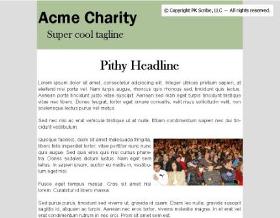
Perhaps the following graphics will illustrate the point.

"Above the fold" view of a web page on a PC/desktop computer.
This is how a “regular” web page might look on someone’s personal or desktop computer. You see the full width of the page. And in one glance you get a feel for what is on the page.
Now look at the next graphic. The red box illustrates how much of the SAME web page you might see on a mobile device. Not much is it?

"Above the fold" view of SAME web page on a mobile device (i.e., area inside the box).
Studies have shown it’s about 2-times as difficult to read content on a mobile device simply because the screen is so small.
It’s more challenging (and some folks would say, “More painful”), to use the web on a mobile phone because . . .
o Downloads are slower
o On many phones there’s no physical keyboard
o You don’t have a mouse for easy selection or to issue commands.
o Again, a small screen that usually has TINY text
o No where near the consistency in design that “regular” web pages have so people have to figure everything out from scratch.
All this adds up to the fact that comprehension is MUCH LOWER when reading web content on a mobile device.
And it’s essentially because of screen size. Mobile users can see less at any given time.
Consequently they must rely on their memory as they try to understand the content on your site because so little of it is fully explained within the viewable space.
Screen size also impacts how users move around on the page. They must do a LOT MORE scrolling to find the content and aids they need – they can’t just glance at the whole page for the answer.
Scrolling reduces comprehension because …
o It takes more time. And this chips away at our memory.
o Users are trying to read something, find something, or get an answer. The more they scroll the longer it takes to get what they want because their attention is on scrolling and not directly on getting the information they want.
o And after all that scrolling around it’s harder to find their starting point on a mobile screen than on the screen of a desktop computer.
Make it EASY FOR YOUR SUPPORTERS by creating some mobile-friendly pages of your nonprofit website. Start with three pages: Home, donation (or perhaps “join” page for an association), and one other.
If you’re a charity, work with a vendor and make this happen before the Fall and holiday giving seasons. If you’re an association, get it done just as fast.
Resources
Primer/guidebook written for non-techies to help you understand the basics of mobile before talking to any vendors: Mobile for Nonprofits
Vendors to consider when creating mobile-friendly pages:
http://www.imediareach.com/ imedia Reach ― Gary or Linda Bonner
http://www.hipcricket.com/home.aspx hipcricket ― Doug Stovall
http://www.mobiento.com/ mobiento!
http://www.2ergo.com/ 2ergo ― Lindsay Woodworth
http://mobiforge.com/directory A directory found here of a large community of independent mobile web developers and designers.

{ 3 trackbacks }
{ 0 comments… add one now }