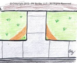
Ever notice how people take the shortest path when walking? For example: Sidewalks from the street to the building are straight with square corners. But people cut across the grass to walk a shorter distance.

Whether walking & cutting across the grass, or strolling through a website...people want fewer steps & clicks
It doesn’t matter if you’re out walking, or you’re strolling through a website.
People want to take fewer steps … they want fewer clicks to reach their goal … they want the shortest path.
So when you send an email inviting people to join your association (or donate to your charity), don’t force them to click 4, 5 or more times.
Twice would be ideal. One click within the email to the landing page. And a second time when they click the submit button on the landing page after filling out the registration form. If two clicks are impossible, then strive for three.
Why is this important? Because with each additional click you lose more prospects.
Extra clicks are costly. They cost you money in terms of lost revenue. And they annoy prospects because it costs them time waiting for new pages to load, and then working through the content on each new page. That’s why extra clicks drive them to abandon your site.
I encountered an association last week with this arduous path:
- First click is in the email. Now I’m on the landing page.
- Landing page is generic and is used for a variety of online campaigns. So I have to look it over and spend time finding what’s relevant (you just lost a batch of prospects). Ah; there’s the “Join” button. Second click.
- I’m on their main website now with full navigation. The page lists the four different types of membership but no info included to help me decide which one applies to me. The names of the five types aren’t obvious to this prospect. Sigh.
- Click #3. I make a guess that type-A might apply to me. Now I’m on another page with the description and fee amount. Nope. Wrong guess. Click #4 back to the list of membership choices.
- Click #5 is when I try yet another type of membership. “Yeah! That’s fits me. But is it the best fit? Could one of those other two options be ideal and maybe even be a lower membership fee? I better check.”
- Click #6 – 9 are me going back and forth researching the last two membership choices.
- Click #10 is when I return to the second choice/type of membership I looked at earlier which is the right for me. Now I start filling out the laborious registration form (but tips on simplifying that is a topic for another blog post).
My point is this. How many people would have stayed with you for the 10+ clicks it took? You would have lost numerous prospects along that long path.
Yeah, a small portion will return later when they’ve got time to slog their way through the maze of clicks and web pages. But most won’t. You’ll need to spend more money on subsequent rounds of solicitations. And the odds are you’ll never capture back all those you lost.
Make it easy for your prospects. Let them cut across the lawn. Reduce the number of clicks they have to make to reach their goal. Your association (or charity) will enjoy higher conversion rates and more revenue with lower acquisition costs. It’s your shortest path to higher ROI.
Related to “making it easy” for member and donors:
Are you cultivating website visitors? Or chasing them away?
