I’ve been silent on this topic for quite some time. I was hoping people would “see” the light and change their ways. Sigh. No such luck.
The use of gray font – and often incredibly pale gray font – still prevails. You’ll strain to see it in emails, web copy, and even print.
Ladies and gentlemen: Almost nothing is easier to read then black print on a white background.
A movie has made “shades of gray” popular. But that doesn’t mean it’s a good idea to use shades of gray font in your nonprofit messaging. Black ought to be the most common color of choice.
Why black? Because as I said before, it’s the easiest for people of all ages to read.
I also believe that you’re hurting response by using font colors that have very little contrast with the background. This dastardly gray is the prevailing villain. But other examples include light blue on yellow, or pale gray on lavender, or red on black, and almost any reverse font combo is harder to read.
So why make your donors, members, prospects, and readers struggle to read your message by using gray font? And they are struggling. Allow me to illustrate.
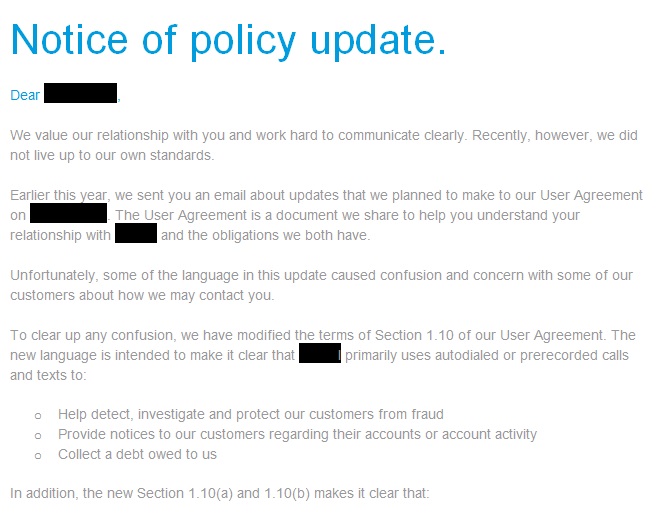
Look at the two images below. The text is an excerpt from an email I received.
At a glance, which of the two is easier for you to read? “A” or “B”?
“A”
“B”
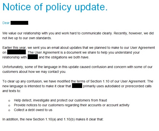 The first one (A) is how it arrived in my in box. And the second one (B) is the same message converted to black font (that’s pure black and not some shade of gray).
I’m betting that if I took a poll the clear winner by a landslide would be “B”, the second one – black font.
Please, please, please get rid of that gray on your website … in your emails … and almost anywhere graphic designers are using it. This mistake (font color choice) frustrates donors and frustrated readers don’t respond as well.
If you want to do everything you can to please your supporters and raise more revenue, then stick to basic black for the main body copy. You can use other colors that also have a lot of contrast to the background for headlines and such. But basic black wins the day for your most important copy.
And if you think I’m nuts, run a 50/50 split test with the color of the font as THE only variable – pale gray versus true black on a white background. Please let me know the results.