I’ve often written about website usability in my newsletter and here in the blog. And I’ve shared links to show the good, bad, and the ugly of nonprofit websites. I’ve also used tables to compare and contrast “fuzzy” nonprofit language to “clear” terms donors understand.
But I just came across a cartoon that puts the usability issue in a whole new light.
This first cartoon by Randall Munroe (http://xkcd.com/) cracked me up. Munroe created a cartoon that compares what a university puts on their home page versus what people are actually looking for when they come to the website.

Courtesy of xkcd.com
Notice that there’s very little overlap. The only thing they have in common is the “full name of school!”
I think that a big chunk of the nonprofit website usability problems stem from a disconnect. Specifically, a disconnect between how a fundraiser thinks and how a donor thinks. Your website will resonate with donors when you think like they do.
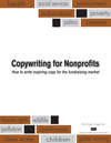
Munroe inspired me. So I created a slightly less sophisticated cartoon of my own. Mine illustrates the disconnect found on many charity websites . . .

Charity Website Disconnect
Advising you to “think like a donor” is sound advice. I hope these cartoons demonstrate why that way of thinking is essential when you write any copy, or prepare any marketing communications.
Eliminate the disconnect. Make your nonprofit website reflect the thoughts of your donors.