And no, this has nothing to do with Halloween. I’m referring to the amount of copy that remains after merciless editing for a mobile-friendly version of your story.
When people pick up their mobile device it’s primarily because they’re killing time. They’re waiting in the doctor’s office and want to pass the time. They’re riding on the commuter train. They’re browsing during the TV commercials. They’re in a boring meeting waiting for someone to say something interesting.
But even though these people are “killing time,” that doesn’t mean they want to “waste time” reading a bunch of fluff or filler content.
Where’s the beef?
Mobile users don’t want to spend time searching for the beef – the guts of the story. They want it visible and served up first. Yes they might be relaxing and killing time, but when in mobile-mode … they want all beef. No filler.
This is because they’re relaxing with a purpose. That purpose is to find something out NOW or to simply have lots of fun and thrills with a game.
Therefore, you must take your direct mail letter or email and chop it down without mercy until it’s condensed into a few short paragraphs. Then let people who want more details click to get more on the next screen … and then even more on another screen for the deeply interested.
Mobile demands the skeleton have no fat or extra tissue
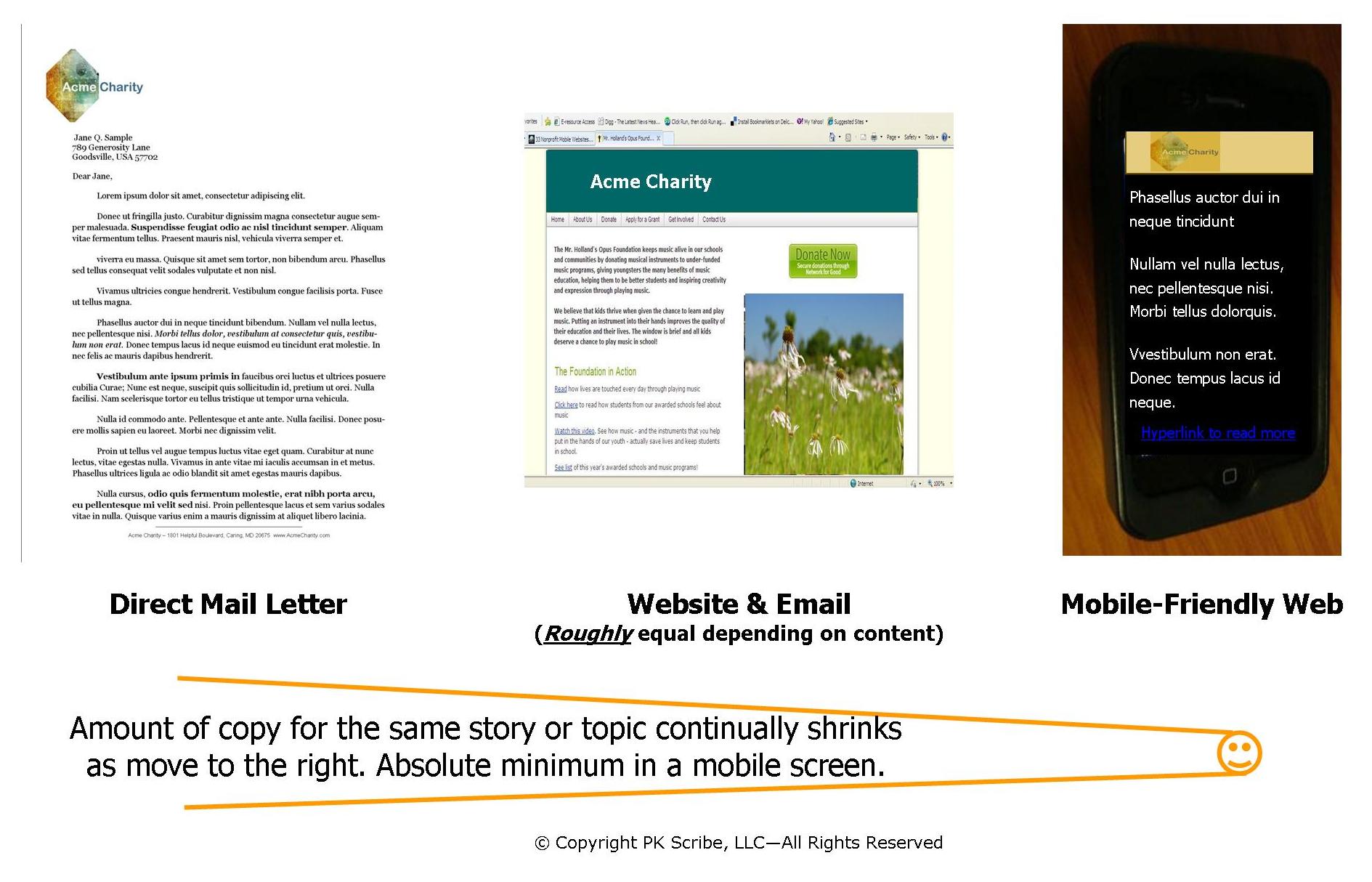
For example: Let’s take an integrated campaign with direct mail, email, your website and mobile.
In the diagram below see how the amount of copy continues to shrink drastically as we move to the right.

Stick to the main points when writing for the mobile web.
What’s the ONE thing you want readers to know and understand above all else? What must they understand and do?
Share that first. Add a short few clarifying paragraphs and then links to secondary screens for those who want to know more.
If you try to give the skeleton too much shape by filling in with lots of details, mobile users get almost instantly bored with your wall of text and leave your site.
And for mobile, even several very short paragraphs that lead to lots of scrolling quickly become a wall of text. Writing copy for mobile users is a whole new world. And also an exciting one.
Like what you found here? More related posts:
Friendly Nonprofit Websites (mobile-friendly, that is)
Mobile for Nonprofits – a primer for non-techies

{ 1 trackback }
{ 2 comments… read them below or add one }
Great reminder. Mobile users are of a completely different mindset than those on the computer… love the relaxing with a purpose comment – so true.
Hey Chapin,
The amount of patience and time we’re willing to give to mobile copy is somewhat comparable to the size of the device. In other words: Mobile users have a SMALL amount of patience finding what they want. And they’re only willing to give you a SMALL amount of time to deliver it.