If you want donors, members and advocates to respond … they need to be able to EASILY read what you have to say.
This is true for direct mail appeals, brochures (if you use them), emails, and your website text. Readability is a must.
I often point out that poor color contrast hurts readability. Such as reverse font; or gray on gray; or yellow on light blue.
 Today I have gems to share from an article I read on choosing fonts for your website.
“What’s the Best Font for Your Site? (The Psychology of Fonts)” by Derek Halpern on Social Triggers.
As the title implies, he discusses the psychology of your font choices. In other words, how web visitors react to fonts.
And he points out that performance is more important than appearance. Your first priority is to make it easy to read … and inviting to read so people stick around and respond to your messaging. You raise more money this way.
Yet it is possible to have a site that not only performs well, but also looks great. Just remember that the main goal of a font is NOT to look snazzy, dashing or incredibly creative.
A font’s main purpose is to be read. Period.
So again, the ideal font is one that’s EXTREMELY easy to read. In Halpern’s article he shares research on how your font “… can either entice or repel your readers” and donors.
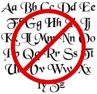
Your choice is between simple and fancy. Guess which one is the correct answer. Yup. Simple.
Simple for the main body, headlines, etc. If you want a tiny splash of fancy – just don’t get carried away – then fancy fonts could be used sparingly in your sidebar headings, taglines, or something small.
More insights from Halpern’s article:
◊ Simple fonts are unassuming. It looks easier to read and therefore is more likely to get read by web visitors.
◊ Make it larger. Size 16 is the NEW size 12. At least go with a size 14. Even 20-somethings can struggle to read a 12 displayed on their screen. Also, small font size can trigger people to distrust you and your site.
◊ MAIN font should be a simple font, always. That doesn’t mean it has to be sans serif. Georgia, for example, is simple and works great on websites.
◊ Stick with 2 or 3 different font types. Using too many gets confusing and ugly fast.
◊ One combination mentioned in the article is Georgia for the MAIN font (i.e., body copy), Helvetica Neue for headlines, and use a special font to accent sidebar headings.
I recommend you read his article. So what’s the main takeaway from all this? Keep it simple so web visitors will read what your nonprofit has to say. And this also means you’ll get more conversions (i.e., donations, memberships, etc.). And yes, I’ve got some work to do on my site too.
Related posts:
Another important way to keep it simple … Power to the copy. Simple copy, that is.
